Postcrossing Blog

Stories about the Postcrossing community and the postal world

Viewing posts tagged "artist-interview" View all

  icon

Petr Václavek is the creator of the Acorn Elves, beloved characters in the Postcrossing community and beyond.

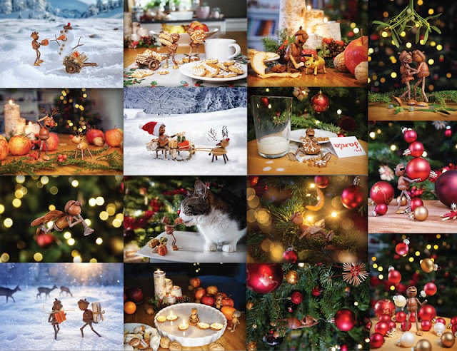
a collage featuring small, handmade figurines crafted from natural materials like acorns, twigs, and nuts, posed in various whimsical scenarios such as reading, making coffee, enjoying nature, and celebrating autumn and winter themes.
Petr smiles with his chin resting on a table, surrounded by small, handcrafted figurines made from natural materials like acorns and twigs, displayed in front of a blurred background of bookshelves.
Petr smiles with some of his acorn elves

Petr paused from his work last autumn to share with Clarisse (aka CStar9) how he got his start in photography, give us an inside look at his artistic process, and let us peek at the cute stickers he debuted last year.

You’ve described the acorn elves (dubánci, in Czech) as a happy accident. When building woodland characters to entertain your children, you ran out of chestnuts and switched to using acorns. At what point did you realize this was an idea that could be widely – even globally – popular?

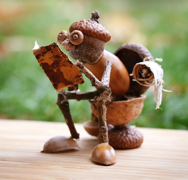
Yes, it was exactly like that – the acorn elves were created by accident. We ran out of chestnuts and so I used acorns instead, which we had plenty of in the garden. I first realised the popularity of the acorn elves when I posted the first pictures of them on social media – everyone loved them and they were one of my most successful posts. But it took me another year to realize how popular they really are. The first year I made only two or three figures, but a year later I made more and since then I’ve been making them regularly. The most successful one was of course the one sitting on the toilet, which literally went around the world (at least on the internet).

An acorn elf sitting on a toilet made of half a tree nut, reading a newspaper made of birch bark
The most famous and widely shared acorn elf
What are some elements that define Dubánci for you?

Playful, curious, mischievous, funny, mischievous again… They are forest creatures that have inhabited oak forests since time immemorial (sometimes you can see them in nature, but they are very shy and can hide themselves skillfully), but at the same time they are – at least some of them – very curious and so they watch what is happening in the human world and then try to imitate humans. But they don’t always get everything right and that’s how a lot of comical situations arise, which I like to capture in photographs.

How do you get an idea from your head to the final image? Which step in that process is generally the most challenging / time-intensive?
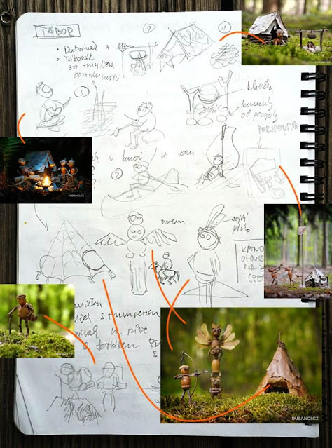
a mosaic of pencil sketches and photos of acorn elves
Learn more about Petr’s process behind one picture.

The process is sometimes a bit lengthy – sometimes it takes a few years from the initial idea, because I have a lot of ideas and they keep coming. In order to get them out of my head and not forget them, I write them down – actually, I sketch them – in a notebook, and then once in a while I make one of the ideas come true – I build an acorn elf based on the sketch, take it to the woods or some other nice place, take a photo of it there, and then edit the photos in Photoshop at home.

Sometimes the hardest part is to make the acorn elf, sometimes to glue together its equipment (bike, motorbike, lantern), and sometimes it’s much harder to take photos. Just to find a suitable place in the forest I have run dozens of kilometers there. Sometimes the shot needs a lot of editing in Photoshop, because even digital photography isn’t omnipotent (or I shot it wrong).

But I enjoy all of the above stages and am happy when the result entertains the fans.

Is there a particular image that has a funny or surprising creation story?

It’s interesting that even after eight years I still remember where I took each photo, including the story that led to the photo. Many of the photos were taken with my youngest daughter in the stroller – when she was about to go to bed after lunch, I loaded her into the stroller, grabbed my acorn elves and camera, and headed out into the woods. Along the way I looked for nice places to take pictures and when she finally fell asleep, I stopped and took pictures of acorn elves.

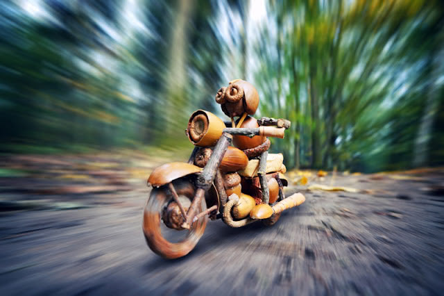
acorn elf on a motorcycle on a road with the forest seemingly whirring by
Faithful copy of the famous Czech motorcycle, the Jawa 250

I have made several means of transport for the acorn elves. The first one was a bicycle (I am an avid amateur cyclist), followed by a scooter, a skateboard and then a motorbike came to mind. But I wanted it to be perfect, so I found the plans of a historic Czech motorcycle, Jawa 250, and glued together a faithful copy of it. It’s probably their most challenging item – it took me 10 hours to glue it together, but the result is worth it!

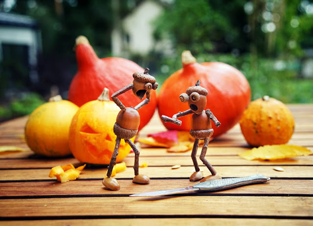
with little pumpkins in the background, two acorn elves stand on a table, one with its hand missing and one with its head off and a wooden pumpkin-carving knife in the foreground
A scene Petr didn’t plan!

While photographing the instructions for making Halloween pumpkin decorations for a children’s magazine, one of the acorn elves dropped his little hand. So I immediately shot a horror scene, which was definitely not in the plan. At least the kids will be more careful of their fingers when they are working with the knife while carving the pumpkins!

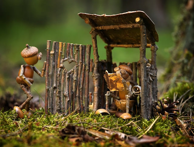
An acorn elf sitting in a portapotty made of sticks, with another acorn elf waiting its turn in queue

My most famous and favourite photo is of the acorn elf sitting on the toilet and reading newspapers. When I was taking a set of postcards for the holiday campers, I thought I would reuse the toilet! All I had to do was make a wooden caddy and a funny new scene was ready!

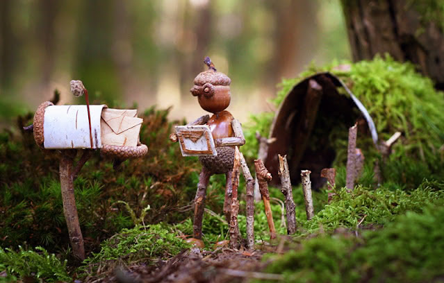
acorn elf pulling mail from a tiny birch bark mailbox
Petr’s first postcard of an acorn elf

This was one of the first acorn elves postcards. The owner of a local postcard company talked me into designing a couple of postcards with acorn elves on them. And when I told him that postcards weren’t used much anymore, he showed me Postcrossing. I was impressed and immediately asked him what should be on the postcard, what motif would users like the most. He replied – well, something with mail, like a mailbox. I immediately remembered that a few days ago I was building little houses for the acorn elves in the nearby forest with kids, so I just glued together a mailbox and some letters and postcards from birch bark at home and went to take pictures.

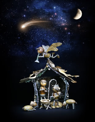
I was once approached by a magazine that said they would like to do an article on acorn elves and that they could be on the cover, but as it was for the Christmas issue they wanted something with a Christmas theme and came up with the nativity scene.

A nativity scene made from acorns, twigs, and leaves, set under a starry night sky with a crescent moon and a shooting star, featuring an angel flying above.

I took it as a challenge and had a great time. Especially shooting in the dark and lighting the scene. It made a perfect cover and to this day it is one of the most beautiful Christmas cards.

What is your studio like?

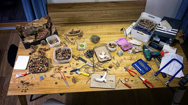
I may surprise you, but I don’t have a studio. I usually glue them in the evenings at home, right in the living room on the table, when my wife and children are asleep. I have a quiet place to work and no one disturbs me. It’s just that the midnight clean-up is sometimes more difficult, because I have to carry a lot of boxes of material and all sorts of tools while I’m working.

A crafting workspace with a wooden table covered in tools, glue, twigs, acorns, and natural materials, used for creating miniature figurines.
Petr’s studio: a table in the living room in the deep night

The most important tool in the work is of course the hot glue gun – it’s unbelievable what you can do with a melt gun. At one time I used to make stuffed animals with my youngest daughter with a melt gun because I got tired of sewing them with a needle :) Another must is a sharp knife or gardening shears. But sometimes you also need to use a jigsaw, a hacksaw, a small cutter or a soldering iron.

And if you ever catch me gluing acorn elves in the evening, you might be surprised how often I look in the mirror and try out their poses – I want the result to look as natural as possible. So sometimes I’ll use a mirror, other times I’ll search the internet for inspirational photos of the pose.

Acorn elves look simple. But there are trade skills needed to create their world: woodworking, photography, and design, to name a few. You learned woodworking in your father’s workshop as a child, then studied software engineering and became a programmer and web designer. When did photography come into your toolkit? And, do you still work as a designer?

When I was a kid, I liked to help my dad in the darkroom when he developed our family photos, but I didn’t try photography then. I didn’t get interested until after graduation, when I was a senior front-end developer for a multinational corporation and the first affordable digital cameras came out.

Sometime in 2003 I bought an Olympus C730 digital ultrazoom with an amazing 3 megapixel resolution and 10x optical zoom. It was a small miracle for me and I fell completely in love with digital photography – I watched a lot of photography websites, had my images critiqued and gradually learned how to take decent pictures.

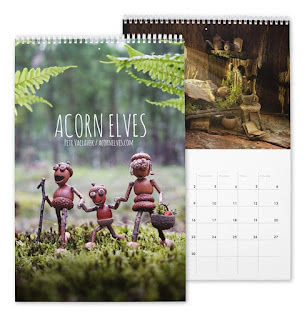
A calendar featuring Acorn Elves on the cover, depicting three handcrafted acorn figures walking in a forest, with a detailed interior photo showcasing a rustic scene.

Everyone liked my photos and I often heard that I could do it for a living. So I tried uploading my images to microstock sites and was surprised at how well they sold. So I gradually built up my portfolio on the microstock in the evenings, and later I started adding vector illustrations because I found they sold even more and I enjoyed making them.

As time went on, my earnings from the microstock were more than my income from my corporate job, so I switched to freelancing. Nowadays, I still make my living from the microstock, but I do other graphic design work on commission from time to time, and then of course the acorn elves make some money too, but I still think of them as my creative escapades that I do for fun.

What is your relationship to postal mail, and how has that evolved over time?

I love the mail, it’s always a surprise what turns up in the mailbox and when it arrives. When I discovered Postcrossing, I thought it was a great idea and I love it! My kids and I have sent several postcards out into the world this way. So I’m keeping my fingers crossed that the price of postage doesn’t go up too much and that Postcrossing will continue to thrive in the future.

a selection of Christmas postcards

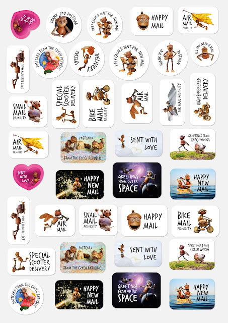
And one more thing – this year I have prepared a special set of stickers with acorn elves for decorating postcards. So maybe someone will like it.

A sheet of whimsical stickers featuring acorn figurines in playful poses with captions like Sent with Love, Snail Mail Priority and Happy New Mail.
Get the stickers here!
What’s something you’re proud of, outside of the acorn elves project?

Definitely my kids! We have three and they’re so smart. My oldest is following in my programming footsteps and my two daughters are incredibly creative, so I have my acorn elves followers.

The acorn elves are now postcards, calendars, stickers, t-shirts, books, even games. What’s next for them, and for you?
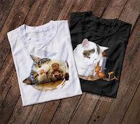
Two t-shirts featuring a sleeping cat cuddling with acorn figurines, displayed on a wooden background.

I’ve been making postcards, calendars, and t-shirts for years. I thought it was a shame to keep the photos only on the internet. This way, the acorn elves are more exposed to the real world and many more people get to know them. Over time, in addition to my Czech e-shop, I started a shop on Zazzle, just to fulfill the wishes of my foreign fans. And of course I also made a separate site in English.

In the last few years, I’ve started to create more books. I began to collaborate with a successful children’s book writer Klara Smolíková and so gradually three books with stories of acorn elves for children were created. It’s a different job again, when I have to read the text and take pictures according to the story.

I didn’t limit the author in any way as to what is and isn’t possible in photography and so there were many challenges that I thought I couldn’t possibly overcome. For example, I photographed a flying bird nest with a lizard and an acorn elf, or an acorn elf with a dog fleeing underground through mole burrows from fighting earthworms. But in the end I did it all! And if I can get a publisher abroad, these lovely books will be published in English.

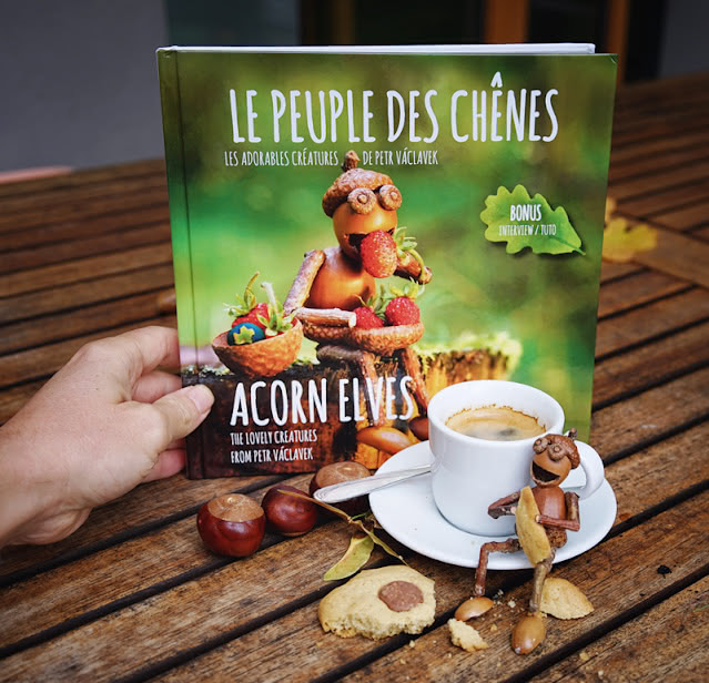
Actually, I have already published one book in France, bilingual (English and French): Acorn Elves – the lovely creatures from Petr Vaclavek. But it doesn’t contain a story for children; it’s a book of my photos with short bilingual captions, a short interview, and a photo guide for gluing and taking pictures of an acorn elf.an acorn sits on a plate eating a snack while a hand holds up the book about Acorn Elves

What does the future hold for the acorn elves?

I’d love to see them in an animated movie or TV show someday. I’ve been working with a Czech company on this for a year now, but it’s a long haul – you can’t do it with one person anymore. I definitely also want to try to come up with a board game with acorn elves in the next few years, and maybe we can make a computer game – that would be a nice stepping stone to a movie.

You can find out more about Petr and his acorn elves on his website, Facebook, Instagram, Youtube or other social media. You can also visit his shop for Europe or for the rest of the world.


And now, for the traditional giveaway! Clarisse is going to send 4 postcards featuring Petr’s Acorn Elves to 4 randomly picked postcrossers. To participate, you have to tell us: “If you could create your own acorn elf, what would it look like or what would it be doing?” Leave a comment below, and come back this time next week to check out the winners!

And the winners of this giveaway, as chosen by Paulo’s random number generator are… ChrStroh, wendyquilter, harrickson and Blumenkohl! Congratulations, and thank you all for participating!

  icon
A box set titled The Snooty Bookshop: Fifty Literary Postcards by Tom Gauld, designed to resemble a book with illustrated shelves and characters.

Tom Gauld is a Scottish cartoonist and illustrator. He is perhaps best known by postcrossers for The Snooty Bookshop: Fifty Literary Postcards, which celebrates more than a decade of his weekly cartoons in The Guardian.

Tom has authored many books—mostly books for grown-ups, but also one of Clarisse’s preschooler’s favorites. Tom’s newest book was recently nominated for what would be his second Eisner Award. But all the accolades haven’t made him too snooty to do an email interview with Clarisse (aka CStar9)! Phew!

Pretend you’re walking onto a metaphorical sports field as the star player for this interview. What psych-up music should we play?

I’ve only had to choose walk-on music once in my life, for a talk in Madrid at a fancy venue. I overthought it for weeks, swinging between cheesy and pretentious choices, but eventually I plumped for “Let’s Come to an Arrangement” by Martin Creed because it felt suitably upbeat and noisy in a funny, slightly weird way. Plus he is Scottish, like me.

What are some of the elements that define your work across your cartoons, graphic novels, children’s books, and more? In 5 words or less, what do you hope people take away?
A spread showing illustrations from The Little Wooden Robot and the Log Princess, depicting a workshop and a magical transformation scene.
Pages from The Little Wooden Robot and the Log Princess

I try to use the language of comics in new ways, while bringing in science, literature, lists, diagrams, games, and puzzles. I want my images to be clean and easy to read, but also to have a hand-made quality with a bit of wobble to the lines and hand-written text.

I don’t really have any kind of agenda or big plans to push. I just want to entertain the audience in a reasonably intelligent way and have them go away (in 5 words) “feeling a little bit happier.”

You’ve mentioned that your job is “to be silly about intelligent subjects.” Why books/literature, and why science?

The mercenary answer is that I get paid to draw on these subjects. The Guardian asked me to do weekly cartoons about books about 16 years ago. Then New Scientist hired me about 8 years ago to do science cartoons. But I don’t think they would have asked if there wasn’t something in my work already that suited the subjects. Certainly I couldn’t have made so many if I wasn’t interested in these subjects.

On some level, literature and science are both about trying to understand the world. There is enough in that (or in people failing to understand the world) to keep me going. Plus, new stories come up every week about advances in science or happenings in the literary world and these can inspire cartoons.

A comic panel with scientists in front of a blackboard discussing equations, a wormhole, and green poodles on the wall.
Comic from Gauld’s book, Department of Mind-Blowing Theories
You submit a weekly cartoon for both The Guardian and New Scientist. What do you do about creative block? Is there a strip you can point to and say, that was HARD WON?

Weekly deadlines really help me avoid creative block. I have no choice but to hand in something by a certain day, so in a way, that frees me from feeling it has to be perfect.

Some weeks I can’t come up with anything that feels really good to me, so I just have to take my least bad idea and make it work as well as possible. And sometimes (quite often actually) I realise later that the ‘least bad idea’ was actually a pretty good idea. I just was too tied up in the creation to be a good, objective judge of its merits.

I have a cartoon called “My Library” which is a diagram where books on shelves are colour-coded into categories like “read”, “intending to read”, “pretend I’ve read” and “read, but can’t remember a single thing about it”.

A colorful library illustration labeled My Library with books categorized by humorous statuses like read, half-read, and purely for show.
“My Library” cartoon, as described in the running text

I have a really clear memory of writing and rewriting those categories and feeling that it was a rather mediocre cartoon and saying to myself, “I’ll have to try extra hard next week to make up for this.” But then it was published and people related to it and found it really funny.

I’ve learned that as you rework a joke, you become overfamiliar with it and lose the initial unexpected spark of humour. But that spark will (hopefully) be there for the reader, so you’ve just got to trust that your past-self was onto something.

As for creative blocks on longer projects without weekly deadlines, which is something I struggle with: I don’t have an answer other than to just try to keep going.

A comic-style web popup warning about bawdy poems with a checkbox confirming age over sixteen in Shakespearean language.
What is your relationship to paper broadly, and specifically to postal mail? And, when can we expect your next postcard set?

I like making work that gets shared around. When I left college in 2001, we were still mainly promoting ourselves with printed stuff, so I made a few postcards to put in with orders for my mini-comics. People seemed to really like them, so I self-published a book of postcards called Robots, Monsters, etc. which outsold all my other self-published comics.

I’ve since made one other set of postcards myself. As you know, The Snooty Bookshop was properly published by Drawn & Quarterly. I’ll certainly do another at some point, but I have other projects queued up first.

Who would you say have been your main influencers? How does your work differ from theirs?

One big influence is Edward Gorey (who also did lots of postcards). I discovered his work in the library when I was studying at Edinburgh College of Art, and it just blew me away. He used the tools of comics and picture books in a unique and brilliant way. His work gave me permission to make comics without feeling I had to follow all the rules or fashions of the form.

I think I’m probably more interested in straightforward storytelling and jokes than Gorey was, but my drawing is definitely inspired by his, as is my interest in visual games.

A comic strip humorously depicting Wordle addiction with a conversation between a person and a therapist.
What’s a hobby you love, or a new skill you’re practicing, outside of your work?

My wife’s father has an old house in the countryside which has lots of old dry stone walls, some of which were falling down. Over the last few years, I’ve been putting them back together. It’s extremely satisfying. I’ve fixed all of them now, but there are a few bits I want to redo. It’s fun to do something with my hands where I don’t also have to think about what I’m saying.

A comic titled Baking with Kafka featuring Kafka’s existential reflections alongside a recipe for lemon drizzle cake.
Tell us about your studio.

Some years ago, I was in a big shared workspace with lots of other creative people, but the area gentrified and sadly the landlord put the rent up too much, so we all scattered. I’m now in a smaller place with two other artists. I worked at home a bit over covid but I prefer having a separate place to go to work, and some company when I’m there.

In the studio, I have a drawing desk, a computer desk, a “thinking” chair, and lots of books. The room upstairs is let to a musician, so we sometimes get piano music and singing drifting down, especially in summer when the windows are open. It’s very nice.

What’s next for you?

I want to make a new graphic novel. Writing my previous ones (Mooncop and Goliath) was probably the hardest thing I’ve done. I think my brain is more suited to short cartoons, but I love the form of the graphic novel so I keep trying.

A spread from Mooncop by Tom Gauld showing a lunar police station and an astronaut in a minimalistic sci-fi scene.
Pages from Mooncop

I’m continuing to make my two weekly cartoons, so work on other projects has to squeeze into the gaps and can be rather slow. But I’m excited about the possibilities of creating a longer story again.

You can explore more of Tom Gauld’s whimsical world on his website, Instagram, and Twitter. Dive into his weekly comic strips for The Guardian and New Scientist, or take a peek inside his studio to see where the magic happens. For aspiring cartoonists, Tom shares his journey and offers advice, while fans of his work can delve into the inspirations behind his beloved books, from the literary and scientific riffs in Revenge of the Librarians and Baking with Kafka to the heartwarming tales in his children’s book (which is SO GOOD!) The Little Wooden Robot and the Log Princess. And last but not least, don’t miss his reflections on crafting stories on the themes of nostalgia and isolation in his graphic novels Mooncop and Goliath.


And now, for the traditional giveaway! Clarisse is going to send 4 postcards from Tom’s Snooty Bookshop or from his (sadly sold out) new set of cards to 4 randomly picked postcrossers. To participate, you have to tell us one book or scientific discovery you’d recommend to an alien visiting Earth — what would it be? Leave a comment below, and come back this time next week to check out the winners!

And the winners of this giveaway, as chosen by Paulo’s random number generator are… Hafizaa, eselbox, Gummu and LulaandLittle! Congratulations, and thank you all for participating!

  icon

Joel Anderson is an illustrator, designer, and founding owner of Anderson Design Group (ADG). Their 63 National Parks, Coastal Collection, and Legends sets of postcards have captured postcrossers’ imaginations and are a favorite of many.

Joel took some time out from his busy Nashville studio to answer Clarisse (aka Cstar9)'s questions via email. All the art included in this post is the work of the Anderson Design Group.

Joel painting a colorful scene of two bears with fireflies glowing around them
In exploring your work online, I keep running into several keywords that describe the Anderson Design Group – nostalgia, golden age, wonder, adventure, local pride. Do these resonate? Are there other descriptors you’d use?
A series of vintage-style posters depicting Radnor Lake, Girl Scout Cookies, 20000 Leagues Under the Sea, Grand Staircase-Escalante National Monument, and Nevada.

These are very good words to describe our style of art. As a student in the 1980s at Ringling School of Art & Design, I was particularly drawn to Golden Age illustrators who created magazine covers, ads, and poster art in the early 20th century, before photography became more widely used. These artists hand-lettered, drew, and painted everything in a romantic, iconic style that glamorized travel, celebrated beauty, and evoked a longing to explore.

The travel poster art of that era was commissioned by railways, cruise lines, automobile makers, and eventually airlines to entice people to buy tickets and go places.

Artwork from that magical era still conjures up a feeling of wonder, awe, and passion. We strive to capture some of that magic in our artwork. Our goal is to pick up where these 20th-century masters left off and continue their legacy for a whole new generation to enjoy.

Tell us about the artists in your design group.

A retro-style illustration of a seagull perched on a signpost with arrows pointing to Beaches and Rat Race. Anderson Design Group is an ever-evolving team of artists who have worked under my direction for 30 years. I was trained to be an illustrator and a graphic designer, so I still enjoy doing some of the artwork myself.

4+ years ago, I was diagnosed with Parkinson’s Disease, so I am gradually losing my fine motor skills. This has challenged me to enhance my skills as an Art Director—sort of like a composer/director of a chamber orchestra. I don’t have to play all of the instruments, I just have to have a vision, the skills to communicate it, and virtuoso players to interpret the vision, adding their own talent, experience, style, and skill along the way.

I have 2 in-house artists (Aaron Johnson and Derek Anderson) who work closely with me, day in and day out. I also have a roster of contract artists who I engage because of their particular style or skill. One of my collaborating artists lives in Spain, another in New York.

Others I’ve worked with live in Colorado, Georgia, Seattle, and South Carolina. You can see all of the artist’s names next to each of the 2,500+ designs on our site.

A vibrant, retro poster of Havana, Cuba, featuring a man and woman leaning against a classic car. The common thread that ties our diverse styles together is attention to authentic detail and a love for Golden Age-styled artwork. I push my artists to create artwork using techniques, rendering styles, colors, and type styling that was popular from 1900 to 1960. We use computers and modern tools, but I encourage my artists to study art history—especially early 20th-century commercial art—and to emulate the sense of style, passion, and grace of that era.

Every year you donate a portion of your profits to the National Park Foundation. ADG has several collections devoted to parks, and you write frequently about individual parks in your blog. At what point did national parks become a focus for the Anderson Design Group?
A vintage-inspired Nashville poster featuring a stylized guitar with flowers and the city skyline in the background.

Our first series of poster/postcard art was created in 2004 to celebrate our hometown, Nashville, Tennessee. It was the Spirit of Nashville Collection, and it featured our favorite things about Music City. That first series of prints won a bunch of awards and began to establish our reputation for doing poster art about specific destinations.

After we had done 150 posters about Nashville, folks from other American cities asked us if we would celebrate their town in the same classic style. So we did posters depicting major U.S. cities like New York, Chicago, San Francisco, New Orleans, Las Vegas, etc. That spawned our Art & Soul of America series.

A collection of postcards featuring artistic renditions of the 63 U.S. national parks in a deluxe postcard set.

As we thought about our favorite American destinations, National Parks ranked high on the list, so we began celebrating several of the National Parks and National Monuments in our classic style.

In 2015, my wife and our 4 kids borrowed an old RV and drove from Tennessee to Utah and Arizona to visit the Grand Canyon, Zion, Bryce Canyon, and Petrified Forest. That trip was life-changing for our family. It lit the flame for our National Parks passion, and it inspired me to begin trying to render one poster for each of the 59 parks.

A colorful poster of Redwood National Park with towering redwood trees and a small red car beneath them. My son Nathan is a writer. He and I had an idea—what if we took all of the poster art and we published a book to celebrate the 100th Anniversary of the National Parks Service? (The Centennial would be in 2016.) So we published the book (59 Illustrated National Parks) and it became a best-seller.

We’ve since printed multiple editions of the book, updating each time Congress adds new parks. (Now there are 63 National Parks.) We continue to visit as many National Parks each year as possible. We love hiking, taking photos, and just basking in the wilderness and wonder of our American heritage. The parks belong to all of us, and they are definitely worth celebrating, protecting, and passing along to the next generation.

I’m personally dying to know the origins of the Legends series, which are my favorite of your cards. What is this collection’s story?
A set of posters showcasing mythical creatures associated with various national parks, including Lizard Man, Mothman, Jackalope, and Bigfoot.

After we had depicted all 63 of the National Parks in many different ways, we began doing research to figure out other interesting aspects of the parks that we had not yet celebrated in our artwork. We had a lot of success with our Bigfoot posters, and we soon began to notice that many of the parks were associated with similar myths, legends, and historical indigenous stories about Sasquatch and other more bizarre cryptids. As we did our research, we came across legends like the Moth Man, Lizard Man, Grass Man, the Jackelope, the Wendigo, and other creepy, unexplained, or quirky tall tales.

This was an artist’s dream, since nobody had ever photographed or videotaped one of these mythical creatures (except for Bigfoot?). All we had to do was piece together the various stories and use our imaginations to fill in the blanks. We found at least 38 different National Parks with significant legends. During our research, we became aware of other mythical creatures from around the world like the Yeti, the Loch Ness Monster, etc. These international creatures are featured in our poster art, but not yet in our postcard sets.

Tell us about your studio [which I hope to tour soon!] – what are some of the inspirational elements there?

I like toys. I like collecting quirky objects (my wife calls them junk). And I like making folk art out of found objects. This creative clutter (pictured here) brightens our studio and adds some whimsy to our decor scheme.

A collage of whimsical artworks including an owl, a robot, and a fuzzy monster, surrounded by various toys and figurines.
You’ve had quite a career. What have been some of the most courageous pivots you have made, and what were the biggest lessons you learned from those?

I am 58 years old now. I started ADG 30 years ago. Back then, we were doing mostly album cover and book cover design work for clients like Universal, Capitol Records, Random House, Harper Collins, etc. That was fun, but my passion was illustration—especially poster art. For the first 10 years, only 10% of our business was illustration, and very little of it was poster-related. Today, our biz is 90% illustration, and of that work, most of it is poster art.

A box for the National Park Adventure Game, featuring illustrations of bears, sea turtles, and diverse national park landscapes.

We made the shift by saying NO to good-paying jobs that did not fit our passion, and saying YES to jobs that let us do what we loved most. Our work and reputation just kept improving as we focused more and more on what we loved to do. We diversified from doing mostly work for clients to doing a combination of client work, retail, wholesale, and licensing. We opened a retail space in our building, we built a good online store, and I began licensing our art to companies who use it on calendars, puzzles, fabric, and souvenirs. Mind you, we’re still a small, family-owned biz run by just me, my wife, and our son Nathan. We only have 4 employees besides the 3 family members.

A sock with a colorful design inspired by Arches National Park, featuring the iconic arch formations against a mountainous backdrop.

Covid was bad for our retail store (it is no longer open), but it was great for our online store. So the big lesson is that life never goes as planned. Challenges can end up being good, even if they cause headaches at first. I believe The Almighty has a plan for each of us, and hence, a good reason for everything that happens in life. I believe that adversity builds character, faith, ingenuity, and humility—all necessary ingredients in living a purpose-driven, joy-filled life! I’ve had to pivot due to Parkinson’s, too… I am now art directing most of the time and not illustrating as much as before (unless I am going for a squiggly, shaky rendering style)!

What is your relationship to paper broadly, and specifically to postal mail (including postcards)?
A drawstring bag spilling over with various vintage-style postcards depicting different national parks and destinations.

I love paper. Poster paper, postcard stock, drawing paper, books—they all inspire me. Computer screens, tablets, and phones lack the warmth, permanence, and heirloom quality of paper products. I still send cards, letters, and postcards. I decorate with framed prints. I love opening the mailbox and pulling out a genuine hand-addressed card or envelope. Who doesn’t?

Who would you say have been your main influencers in design?

Many of the nameless artists of the Works Progress Administration era have greatly influenced my art. Norman Rockwell, NC Wyeth, Kustav Klimt, Roger Broders, Alphonse Mucha, Ludwig Hohlwein, and Tom Purvis are some of my heroes, too. Everything my team creates is inspired in some way by artists who have gone before us. We often mentor art students and give them tours of our studio. Our work is inspiring hundreds of young artists who will eventually follow in our footsteps creating a whole new generation of art. Nothing is new under the sun, yet each new creation nudges art history forward.

What’s something you are most proud of, in your art/design work?

I am very satisfied to know that thousands of people around the world enjoy looking at a poster or postcard designed by Anderson Design Group. I am proud of my artists, my family, and our collaborators who all work together to make accessible, affordable, enjoyable art. And I am so blessed to be able to enjoy the fruits of my labor while I am still alive (unlike so many brilliant struggling artists whose work only became famous or profitable after they died).

What’s next for Anderson Design Group?

We are finishing off our World Travel Collection—a massive poster series that includes at least one poster for every country on the globe. It would make a fabulous 200-piece postcard set, but it would probably cost about $100… so I’m not sure if people would buy it! Maybe we could break it up into smaller collector sets—divided up by continents? But wait—Antarctica would be a pretty small set!

A collage of vibrant travel posters featuring destinations such as Paraguay, Barbados, Zhangjiajie, Denmark, Vancouver, and Australia's Sunshine Coast, each with distinct, colorful illustrations.

To learn more about Joel and the Anderson Design Group work, check out their website and shop. You can also see this video interview on Joel Anderson’s origins and growth as an artist and business founder, including how to approach failure! And last but not least, you can learn how Anderson Design Group’s Spirit of Nashville series became iconic in Nashville.


And now, for the traditional giveaway you’ve all been waiting for! Clarisse is going to send 4 postcards from the Anderson Design group to 4 randomly picked postcrossers. To participate, leave a comment below sharing your favorite national park from your country. Four winners will be picked and posted here next week.

And the winners of this giveaway, as chosen by Paulo’s random number generator are… ffuesch, annegret, Potatosium and betslets! Congratulations, and thank you all for participating!

  icon

Postcrossers that received postcards from Europe last year may have noticed a colorful stamp motif gracing some of their postcards. Linda Bos and Runa Egilsdottir, a design duo known as the Designers’ Collective, created the “peace knot” stamp for POST Luxembourg’s winning entry to the EUROPA Stamp Competition in 2023.

A mashup of EUROPA stamps block sheets, all featuring the 2023 design inspired on the celtic knot
Stamp issues, first-day covers, and maxi-cards issued by European postal companies in 2023.

Last winter, Linda and Runa took time to share with Clarisse (aka CStar9) the origins of this design and their deep connection to stamps and mail.

But first, a bit more about the stamp. Each year since 1956, the EUROPA stamp program has encouraged continent-wide collaboration on stamp issues around a common theme. If you’re new to EUROPA stamps and want to learn more, check out last month’s post about them! In 2023, the EUROPA theme was “Peace – the highest value of humanity”, declared to express European solidarity with Ukraine.

The EUROPA design competition draws dozens of entries by national postal systems in Europe every year. Linda and Runa’s peace knot design won the competition for POST Luxembourg in 2023. Their design was subsequently adopted as a EUROPA stamp issue by more than 50 postal companies in Europe.

The 2023 EUROPA stamp, featuring a stylized celtic knot holding hands
The winning design
Can you tell us more about your approach to the peace knot as a graphic concept in this stamp?

We wanted the peace stamp to represent every single person in the greater region of Europe, regardless of their origin and belief.

After researching existing peace symbols, we realised they had either religious origins (like the dove and olive branch), or we sensed they were no longer suited for our time (like the common peace symbol, which started its life as a symbol of the British anti-nuclear movement), or they had evolved to having a different meaning in certain cultures (like the ‘two fingers up’).

We concluded it was time to create a new peace symbol for Europe!

When delving into the very diverse world of symbols from all over Europe for inspiration, we found the Celtic love knot to be very fitting to base our design on. The meaning behind this knot is love and connection; there are four hearts ‘hidden’ inside.

To strengthen the message of unity and cohesion, we created two sets of hands with interlaced fingers instead of the classic handshake, which in our opinion would have given it too much of a political and corporate vibe.

An earlier sketch of the design
An early sketch of the peace knot design.

We then decided to apply a colour palette derived from flag colours — and a new peace symbol was born!

We like to add that we were delighted to work on this project together with Emile Espen from Post Philately Luxembourg, who commissioned us on this project and who gave the good-to-go for this symbol.

Linda and Runa receive an award
Linda and Runa: the Designers’ Collective (accepting a German Design Award in 2018)
What is the origin story of your collaboration?

Both of us studied design. We had been working in the field separately until our paths crossed over a decade ago. There was an immediate click, both personally and professionally, so we decided to help each other out on projects. We soon realised that our skills were very complementary. We work much more effectively and raise our work to the next level, when working as a duo.

Was this your first effort to design a stamp, either individually or as a collective?

Linda designed her first set of Europa stamps in 2012, followed by the 2014 Luxembourg Christmas stamps and a special block for the 2017 Multilaterale Hertogpost Philatelic Exhibition.

The latter appeared in both the Netherlands and Luxembourg. There was a unique block containing stamps from both countries.

Other stamps designed by them
Linda Bos’s stamp issues for POST Luxembourg

We then designed some stamps commissioned by clients as a duo. The peace knot stamp was the first one commissioned by POST Luxembourg for us to design together. The success of this design proves to us that we should continue working together for sure!

What are your personal relationships to postal mail?

We love to send and receive postal mail. Of course nowadays, a large part of what once needed to be sent by postal mail has been replaced by email. But this makes it even more special to receive ‘real’ mail.

Each year we put a lot of thought into our Happy New Year card we send to our clients. We don’t believe we will ever opt for a digital version, which can never replace the excitement of opening a nice envelope and touching a card printed on special paper.

What’s next for you as a collaborative duo?

Creative world domination!

You can learn more about Linda and Runa’s work on their website, or on their Instagram and Facebook pages. You can also watch a brief interview about the peace stamp or check out Linda’s 2019 midwives stamp.

  icon

Rose Wong is a New York-based illustrator whose work can be found in the popular Flower Box set, and in the pages of The New York Times, the New Yorker, The Atlantic, and more.

On the left half of the image, Rose's set of 10 flower postcards are spread out on the floor. On the right, Rose laughs to the camera in her studio

Last year, Clarisse (aka CStar9) caught up with Rose via web-cast in her Brooklyn studio. All the art pictured in this interview is Rose’s work!

A heavily stylized illustration of several buildings. Through the windows, you can see the inhabitants doing all sorts of things
When did you first identify as a visual artist? You’ve said that as a child, you used to make intricate drawings in Microsoft Paint.

I’ve always been a visual artist. It was something I just liked doing. No one prompted me to do it. I really wish I had the forethought of saving all those MS Paint drawings I made back then, but it was a different time.

Deciding to go to school for visual art was a more serious step. I didn’t even know what illustration was. Drawing, right? Fine art drawing? But then I did research and saw it was more along the lines of what I thought I wanted to do.

A minimalistic illustration of a house lifting from the ground. A person is suspended between the flying house and a trap door that just opened on the ground where the house stood.

That was a huge leap of faith for me, and for my parents who were funding me through school. My parents immigrated from China before I was born. I’m the oldest child, and they hadn’t really gone to college, so I was the first. I had cousins who had done the STEM career thing, and my parents just said, “You shouldn’t do that. You should do what you’re best at. Yeah, you should do art.”

When I graduated, I did a couple of editorials here and there — commercial jobs like book covers. But I was still very much in the student zone, figuring out my style and getting a footing in what it meant to work for clients.

I think I really became a visual artist when I started working full-time in 2018. I had been laid off from my job. And I was worried, because I didn’t ever make the decision to go freelance. I just started doing it. About a year later, when I started getting consistent jobs, I thought, oh, wait, I’m professionally a visual artist now.

The New York Times was my first client. They’ve been my repeat client ever since.

The 10 postcards in the Flower Box that represent you are “Blue No. 1” through “Blue No. 10”. Can you tell us about the roots of these cards?

Initially the drawings were black and white. But they said another artist in the box was already doing black and white, and they thought two black and white sets would be confusing. So I was like, you know what, I do sometimes draw in blue, so I digitally changed it — my inspiration being Chinese porcelain.

That was in 2017, before I did as much digital work. I was drawing from life. I used to go to the Botanic Garden to draw, after days at my full-time job. That was my oasis.

We can see some plants in one of my recent sketchbooks: these are drawn with gel pen on Moleskine.

Rose showcases one of her notebooks. Both sides are covered in drawings, featuring geometric renditions of plants
Is that sketchbook gridded? How on earth do you make such straight lines?

Sometimes you find materials that are just right for you. Grids have informed my drawing a lot. It also just makes my brain feel good to draw straight lines and to fill in in black. I use a ruler now, but all my plant stuff in 2017 was pre-ruler, just using the grid. It was all very neat. That’s what I think adds to the “design”-ness of my work. It’s not just free-form.

This is my most recent still-life. You can see it’s a return to less linear.

Rose holds up her sketchbooks, featuring plant drawings
What do you think is responsible for that shift?
A minimalistic illustration of leaves floating around. In the center, a tiny person can be seen, surrounded by the leaves

In my craft, even for editorial, I always start off drawing. I let myself be really scribbly with pencil and paper. When you move to Illustrator, everything gets straighter and tighter. So, working from analog paper to digital — the digital has now affected how I do the analog.

In my early editorials, I was trying to imitate the tight aesthetic of digital, and it was really difficult. Illustrator has taught me how to create shapes. It’s so funny to say that, but shapes didn’t come as naturally to me when I was drawing freely. I was just drawing what I was seeing. But then I started to see the flowers and plants I was drawing as squares, circles, ovals.

Of course lately there’s a desire to go back to natural, because I feel like maybe I’m too stiff now when I draw. I’m rulering everything and making it too perfect. So, analog and digital really affect each other for me. The two are in conversation, constantly.

How do you go from observing something to creating art on the page?
An illustration showing four sets of books that seem to portray fantastical worlds, with characters and scenery coming out of them

I graduated from Pratt Institute in 2014, and I got my first job working at Fishs Eddy, which is a kitchenware store. I was the assistant to the product designer and visual merchandising designer, so I was working both upstairs and downstairs of the store. I had learned Illustrator in school but had never applied it. So, during this time I was turning a lot of traditional drawings into vectors in Illustrator, to be printed onto ceramic ware. I was doing that for hours — just, like, tracing a floral design — as my job. And I got really good at Illustrator, and at the pen tool!

But also at that time, I was doing a lot of location drawings with my partner and some friends who had a plein air club. I was starting to develop a style by looking closely and trying to simplify what I was seeing. Now I do image research by spending a lot of time with books, bookstores, and museums. My partner, who is a book designer, is really good about this. Before, I would just look at one thing and then try to create something. Now I’m trying to be more intentional. When I was doing my most recent zine, I had six books laid out on the floor. As much as I love my folder of Instagram saves, it’s so nice to have books around, so I’m not searching through my computer for my inspirations. I have them all together in one place that’s real.

What’s your relationship to snail mail, or to paper and stationery in general? rosewong12

It’s so funny, because I love receiving stationery. I love collecting postcards. I love the images. But I don’t write many letters. I save all the wonderful postcards and little notes sent by my friends who love letter writing and care packages. I am terrible at making time to write little notes, but it might one day click for me.

Can you tell us about your Lookbook project?
A collection of very minimalistic fashion drawings

Lookbook was born during COVID. I got burnt out doing a lot of COVID drawings for client work. I felt like I had no attention span to make art for myself anymore. So, for Lookbook, I gave myself like a set of parameters. I wanted a project that was basically about repeating something small and eventually amassing something bigger. I was already doing these little girl drawings and fashion drawings and repeating them in my sketchbook.

So, here you see basically the origins of Lookbook.

Rose holds up her sketchbook, to show some of her stylized fashion drawings

Then I moved to doing these in Illustrator, which was a lot quicker than drawing them. I would do them in batches of 7 to 10 and post one a day. It was a way for me to quickly create little moments of art: inspiration about this color green, or this shape I saw in real life, or a vegetable I saw that I thought was really nice. I’d try to treat my Lookbooks as if I was drawing in my sketchbook, trying not to delete anything and just keep building. And being like, okay, I’m not going to fuss over them — I’ll just move on to the next one if I have a better idea.

This is not a question but a comment: Please tell your agent that Lookbook should be packaged as a set of postcards.

I’ve had people say, you should make stickers out of this. But I’m holding out for the book first! It’d be so cool for a digital project to come back around to analog, as a book, like we were talking about before. I should reach out to book agents, but that involves all this bureaucratic stuff that artists don’t like to think about when they are making things.

What’s something you’re proud of, outside of your drawing?
A small flower vase or jar made of ceramic, with a tile-like pattern

I’m really proud of my ceramics. When I got laid off in 2018, my friend and I decided to take a ceramics class that we’d already been wanting to do. It was a two-month class. And I said, that’s a great idea — I need structure. I did it as a “treat myself” sort of thing. But then I just fell in love and never stopped! It has woven seamlessly into my life and changed it in ways I never could have imagined.

For me it’s a respite from digital. My ceramics are also different from my illustration because they’re very decorative. I’m finding more ways to simplify patterns within my own language. I’m building my world through actual objects, which is so different than doing it on paper.

So yeah, I’m really proud of that. I also think it kind of links to the idea of postcards, because postcards obviously have a function, but they’re very decorative. The function is what gets it out into the world, but the decoration is why you want to send it. At the end of day, a ceramic piece holds water, plants, or pencils, and but it can also be just simply pretty.

What’s a new project you’re excited about? Or something you’re working towards?
Rose holds up her sketchbook, showing some of her most recent work

Well, I recently just finished my new zine for the Brooklyn Art Book Fair. I do riso printing with my friends from school in a project called TXTbooks. Zines and bookmaking allow me the space to explore something that I’m interested in, in a longer format, which in this case is architecture and imagined spaces.

In my zines there are no words — it’s really a free-form experience — a non-linear narrative. I want it to be an immersive journey. I love feeling like I’m capturing moments in my work.

Otherwise, I am excited to do more ceramics stuff. And I’ve been making a little foray into furniture and other bigger pieces. I’m just really excited to do… everything!

To learn more about Rose, check out her website and Instagram pages! You can also read about her roots as a digital artist, or about fashion and creativity in her recent Lookbook project.


And now, for the traditional giveaway, Clarisse is going to send 4 postcards from the Flower Box set to 4 randomly picked postcrossers. To participate, leave a comment below to share your favorite illustrator that should have a postcard box made with their art (but hasn’t yet)! Come back this time next week to check out the winners!

And the winners of this giveaway, as chosen by Paulo’s random number generator are… reverebeachdweller, Indreni, sagitta and fried_rambutans! Congratulations, and thank you all for participating!